


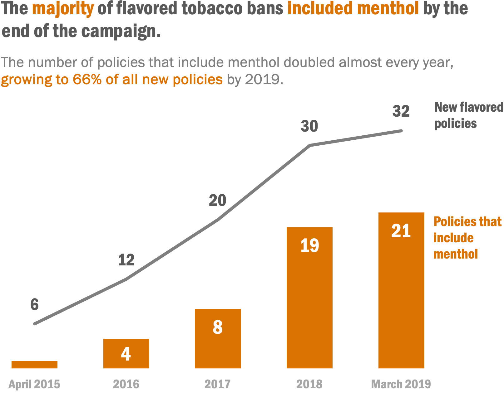
WHY USE A COMBINATION COLUMN + LINE CHART?
Sometimes a data story can best be told by combining two data visualization formats together in one visual, known as a combination or combo chart. Commonly that is done by adding a line to a bar or area chart to show trends or progress toward benchmarks.
 DOWNLOAD TEMPLATE
What’s included in this downloadable Excel file:
the template and instructions for a combination column + line chart